
Your charts are a part of your decision atmosphere.
Colors can have a direct effect on your mood, attention, perceived clarity and emotions, which heavily influence your trading performance.
Humans don’t make rational decisions, but emotional ones, influenced by cognitive biases and trading itself is more psychological than it is technical.
So why not design your charts in a way that supports your psychology?
How chart colors influence your trading psychology
Changing your chart colors alone won’t automatically turn you into a profitable trader, but they influence your psychology, which can make it easier for you to eliminate the factors that are holding you back.
Different colors trigger different moods and emotions.
Generally speaking, warm colors, like red, orange and yellow are considered stimulating, while cool colors, like blue, purple and green support calmness, relaxation and enhanced focus.
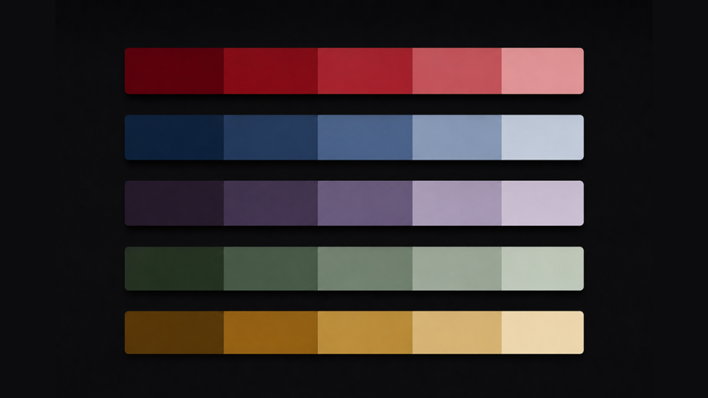
Highly saturated charts usually trigger emotions while lower saturated charts have a more calming effect.
Monochromatic charts
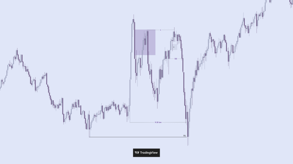
When you trade a monochromatic chart, your brain doesn’t have to process competing color signals.
The whole chart reinforces the same emotional tone.
A monochromatic blue chart can feel:
- calmer
- more analytical
- more controlled
Because blue is associated with slower heart rate and reduced cortisol response.
While a monochromatic red chart can feel:
- more urgent
- more aggressive
- more intense
Because red is associated with an elevated heart rate, increased adrenaline and faster reaction times.
It’s about visual cohesion, cognitive load, nervous system stimulation, attention direction and emotional association.
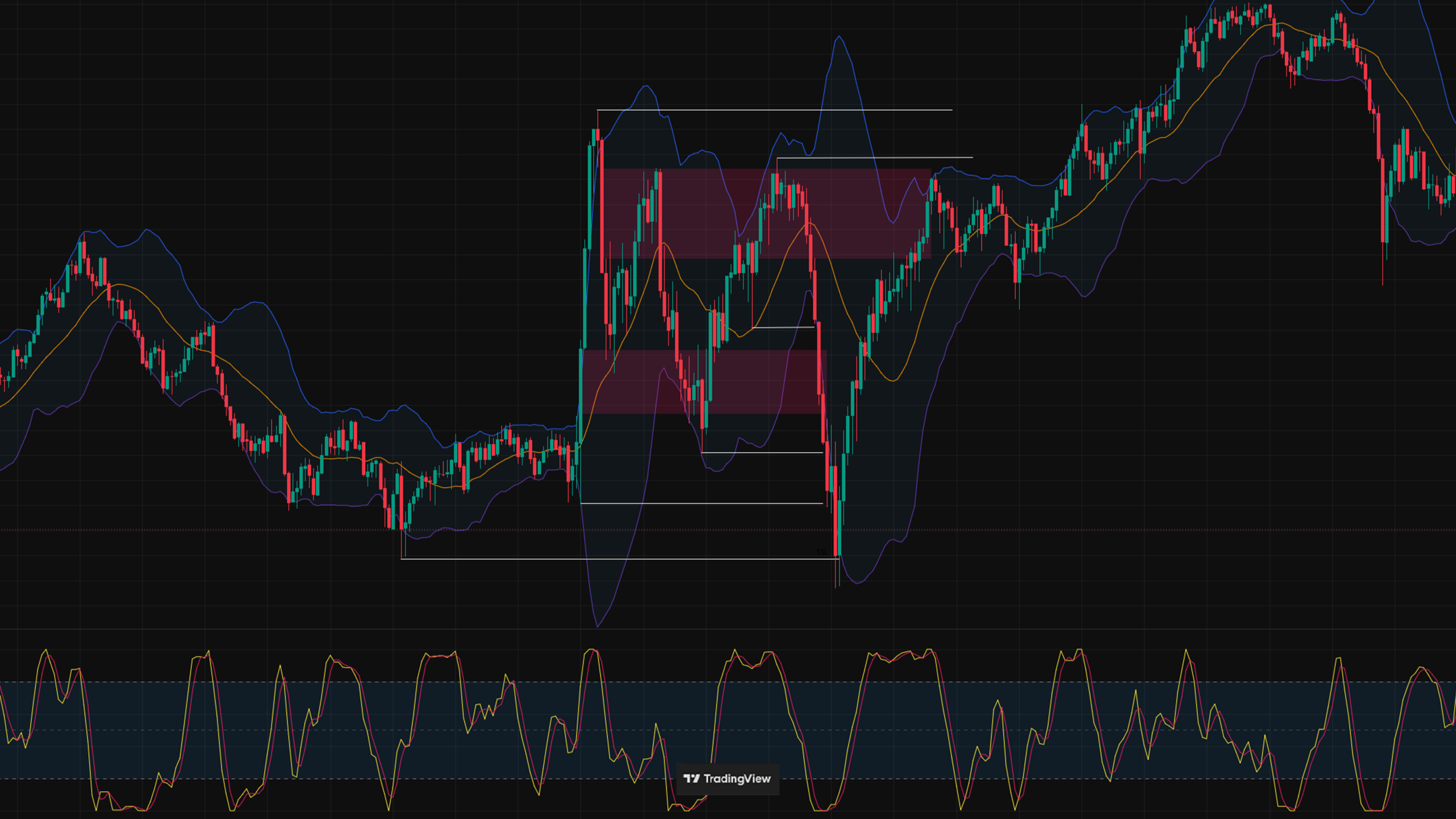
A chart that has red and green candles, five indicators in different colors and multiple levels marked up forces your brain to process many different signals simultaneously.
That’s also why it’s important to keep your charts clean.
Look at this chart:
charts by TradingView
And compare it to this monochromatic chart:
charts by TradingView
Which one is easier to read?
That’s also a reason why luxury UI design, premium branding and institutional dashboards often use limited palettes, tonal consistency and restrained saturation.
Low contrast monochromatic charts
Monochromatic low contrast charts especially can have a quite noticeable effect.
It’s a monochromatic chart that has very similar colors for bull and bear candles.
A monochromatic chart with obviously distinguishable bull and bear candles is processed differently psychologically than a low contrast monochromatic chart.
With a monochromatic chart, your brain can still instantly classify direction through color separation.
A low contrast monochromatic chart removes directional color coding almost entirely, which changes perception in a unique way:
The brain loses the immediate bullish/bearish emotional attachment based on the color signal of a single candle.
Usually your attentional system would instantly tag them emotionally. Even subtle color differences can trigger this automatically because humans evolved to react strongly to contrast and color signals. This is called pre-attentive processing – meaning normally, color is processed before conscious thought.
So when bull and bear candles are nearly identical in color, the brain cannot rely on instant color categorization and has to process context first.
This essentially forces your visual system into relational processing instead of categorial processing.
You need context when you make trading decisions.
Take a look at this low contrast monochromatic chart:

charts by TradingView
Which chart colors should you use?
There is no layout that’s best for every single trader simultaneously. You should choose based on your personal characteristics. One trader might benefit from a calmer, more monochromatic chart while another might benefit from a chart that signals more urgency.
If you struggle with slow reactions for example, red in your chart could be a good fit for you.
If you struggle with taking trades out of emotional impulsivity, you could benefit from a monochromatic blue chart.
If a bull or bear candle can override your perception of context, no matter the color, a low contrast monochromatic chart might be the best choice.
Aside from that people can have different reactions to different colors, just because blue is generally perceived as having a more calming effect doesn’t mean every person actually perceives it that way.
However, keeping your charts clean is a must. No matter what.
Trading is highly subjective and deeply tied to you as a person. It’s just you and the charts.
This article is for informational purposes only and does not constitute financial advice.